Style guide

Colours, type, buttons, form fields and cards used across the site. Each style names the token that sets it.

Style guide

Colours, type, buttons, form fields and cards used across the site. Each style names the token that sets it.

Style guide

Colours, type, buttons, form fields and cards used across the site. Each style names the token that sets it.

Colour tokens

Colour tokens

Colour tokens

Ground

Light #F6F3EC

Dark #171511

Surface

Light #FCFAF5

Dark #201D18

Ink

Light #1E1B16

Dark #F1ECE2

Muted

Light #6B6457

Dark #A89F91

Line

Light #D8D0C2

Dark #332E27

Accent

Light #8A3B2E

Dark #D98B74

Accent ink

Light #FFF7F2

Dark #1E1B16

On image

Light #FFFFFF

Dark #FFFFFF

On image ink

Light #1E1B16

Dark #171511

Scrim

Light rgba(20, 16, 12, 0.48)

Dark rgba(20, 16, 12, 0.58)

Scrim end

Light rgba(20, 16, 12, 0)

Dark rgba(20, 16, 12, 0)

Band

Light #1E1B16

Dark #201D18

Band text

Light #F6F3EC

Dark #F1ECE2

Band tint

Light #2B2823

Dark #1F1D18

Band field border

Light rgba(246, 243, 236, 0.4)

Dark rgba(241, 236, 226, 0.4)

Accent tint

Light rgba(138, 59, 46, 0.22)

Dark rgba(217, 139, 116, 0.22)

Swatch black ash

Both #2A2A28

Swatch natural ash

Both #D9C7A3

Swatch sand

Both #D9CDB8

Swatch moss

Both #6B7A4F

Scales

Scales

Scales

Every size, line height, letter spacing, space, radius and duration in the build is one of these values, set once in a text style or a section component. Values at 1440, 810 and 390 px wide.

Type sizes

Token

Value

Used for

Heading 1

96 · 66 at 810 · 46 at 390

Page headers

Heading 1

96 · 66 at 810 · 46 at 390

Page headers

Hero headline

64 · 45 at 810 · 34 at 390

Home hero

Hero headline

64 · 45 at 810 · 34 at 390

Home hero

Article headline

64 · 50 at 810 · 40 at 390

Article title

Article headline

64 · 50 at 810 · 40 at 390

Article title

Product headline

48 · 40 at 810 · 34 at 390

Product title

Product headline

48 · 40 at 810 · 34 at 390

Product title

Heading 2

72 · 50 at 810 · 36 at 390

Section headings, FAQ topics

Heading 2

72 · 50 at 810 · 36 at 390

Section headings, FAQ topics

Band headline

44 · 37 at 810 · 32 at 390

Newsletter and closing band headings

Band headline

44 · 37 at 810 · 32 at 390

Newsletter and closing band headings

Menu link

44 · 37 at 810 · 32 at 390

Links in the open tablet and phone menu

Menu link

44 · 37 at 810 · 32 at 390

Links in the open tablet and phone menu

Heading 3

32 · 28 at 810 · 26 at 390

Tile titles, legal and docs headings, row numbers

Heading 3

32 · 28 at 810 · 26 at 390

Tile titles, legal and docs headings, row numbers

Title

28 · 26 at 810 · 24 at 390

Journal and collection titles, cart title

Title

28 · 26 at 810 · 24 at 390

Journal and collection titles, cart title

Card title

26 · 22 at 810 · 20 at 390

Product card names, room tiles, FAQ questions

Card title

26 · 22 at 810 · 20 at 390

Product card names, room tiles, FAQ questions

Name

24 · 21 at 810 · 19 at 390

Material, team and stockist names

Name

24 · 21 at 810 · 19 at 390

Material, team and stockist names

Display lead

24 · 21 at 810 · 19 at 390

Leads under headings, review quotes

Display lead

24 · 21 at 810 · 19 at 390

Leads under headings, review quotes

Small name

19 · 18 at 810 · 17 at 390

Pin card names, cart line names

Small name

19 · 18 at 810 · 17 at 390

Pin card names, cart line names

Scene caption

19 · 18 at 810 · 17 at 390

Captions under pinned scenes

Scene caption

19 · 18 at 810 · 17 at 390

Captions under pinned scenes

Figure

56 · 46 at 810 · 40 at 390

Figure values

Figure

56 · 46 at 810 · 40 at 390

Figure values

Wordmark

30 · 28 at 810 · 26 at 390

Logo

Wordmark

30 · 28 at 810 · 26 at 390

Logo

Heading 4

22

Process and step titles

Heading 4

22

Process and step titles

Lead

19 · 18 at 810 · 17 at 390

Page header leads, form success

Lead

19 · 18 at 810 · 17 at 390

Page header leads, form success

Body

17 · 17 at 810 · 16 at 390

Body copy, descriptions, FAQ answers

Body

17 · 17 at 810 · 16 at 390

Body copy, descriptions, FAQ answers

Prose

18 · 18 at 810 · 17 at 390

Article body

Prose

18 · 18 at 810 · 17 at 390

Article body

Body small

16

Inputs, tables, excerpts

Body small

16

Inputs, tables, excerpts

Price

16

Prices

Price

16

Prices

UI

15

Detail rows, footer links, stockist cards

UI

15

Detail rows, footer links, stockist cards

UI strong

15

Buttons, nav links, text links

UI strong

15

Buttons, nav links, text links

Small

14

Meta lines, hints, notes

Small

14

Meta lines, hints, notes

Small strong

14

Footer headings, field errors, applied chips

Small strong

14

Footer headings, field errors, applied chips

Label

13

Form labels, captions, kickers, table headings

Label

13

Form labels, captions, kickers, table headings

Counter

12

Counter lines, New and Sold out chips

Counter

12

Counter lines, New and Sold out chips

Line heights and letter spacing

Token

Value

Used for

Display

1

Heading 1 and 2, figures, wordmark, buttons, numerals

Display

1

Heading 1 and 2, figures, wordmark, buttons, numerals

Heading

1.05

Display text that runs to two or more lines

Heading

1.05

Display text that runs to two or more lines

Title

1.15

Heading 3, card and tile titles, names

Title

1.15

Heading 3, card and tile titles, names

Heading 4

1.3

Heading 4, chips

Heading 4

1.3

Heading 4, chips

Lead (display)

1.35

Display leads, quotes

Lead (display)

1.35

Display leads, quotes

Label

1.4

Labels, captions, notes, photo captions

Label

1.4

Labels, captions, notes, photo captions

Small

1.5

Small text, leads, inputs

Small

1.5

Small text, leads, inputs

Body

1.6

Body

Body

1.6

Body

Prose

1.7

Article body

Prose

1.7

Article body

Letter spacing, Heading 1

−0.02em

Heading 1, hero, article headline, figures

Letter spacing, Heading 1

−0.02em

Heading 1, hero, article headline, figures

Letter spacing, Heading 2

−0.015em

Heading 2, band headlines, product headline

Letter spacing, Heading 2

−0.015em

Heading 2, band headlines, product headline

Letter spacing, Title

−0.01em

Wordmark, card titles

Letter spacing, Title

−0.01em

Wordmark, card titles

Letter spacing, Label

0.08em

Label and caption (uppercase)

Letter spacing, Label

0.08em

Label and caption (uppercase)

Letter spacing, Counter

0.12em

Counter line and chips (uppercase)

Letter spacing, Counter

0.12em

Counter line and chips (uppercase)

Spacing

Token

Value

Used for

Space 1

4 px

Hairline gaps: card rows, meta lines, chips

Space 1

4 px

Hairline gaps: card rows, meta lines, chips

Space 2

8 px

Icon gaps, label to field, small stacks

Space 2

8 px

Icon gaps, label to field, small stacks

Space 3

12 px

Tight gaps, thumbnails

Space 3

12 px

Tight gaps, thumbnails

Space 4

16 px

Inner gaps, hints, card text, phone insets

Space 4

16 px

Inner gaps, hints, card text, phone insets

Space 5

24 px

Component insets, grid gaps, lead under a heading

Space 5

24 px

Component insets, grid gaps, lead under a heading

Space 6

32 px

Group gaps, desktop grids

Space 6

32 px

Group gaps, desktop grids

Space 7

48 px

Between blocks, footer columns

Space 7

48 px

Between blocks, footer columns

Space 8

64 px

Column gaps, large splits

Space 8

64 px

Column gaps, large splits

Space 9

96 px

Desktop band padding

Space 9

96 px

Desktop band padding

Space 10

128 px

Desktop section padding

Space 10

128 px

Desktop section padding

Gutters and section padding

Token

Value

Used for

Page gutter

48 · 28 · 16

Side padding of every section

Page gutter

48 · 28 · 16

Side padding of every section

Section padding

128 · 96 · 72

Top and bottom of a standard section

Section padding

128 · 96 · 72

Top and bottom of a standard section

Tight section padding

64 · 56 · 48

Shop by room, lookbook list, footer top

Tight section padding

64 · 56 · 48

Shop by room, lookbook list, footer top

Band padding

96 · 72 · 56

Newsletter and closing bands

Band padding

96 · 72 · 56

Newsletter and closing bands

Under a section heading

48 · 40 · 32

Gap between a heading row and its content

Under a section heading

48 · 40 · 32

Gap between a heading row and its content

Panel inset

32 · 28 · 24

Panels, Calm rooms text bottom

Panel inset

32 · 28 · 24

Panels, Calm rooms text bottom

Photo tile inset

24 · 20 · 16

Text inset on photo tiles

Photo tile inset

24 · 20 · 16

Text inset on photo tiles

Radius and motion

Token

Value

Used for

Radius

0

Every rectangle: buttons, inputs, cards, chips, panels, images

Radius

0

Every rectangle: buttons, inputs, cards, chips, panels, images

Radius, round

50%

Pins, finish swatches, radios, the pause control, the theme button dot

Radius, round

50%

Pins, finish swatches, radios, the pause control, the theme button dot

Ease

cubic-bezier(.2, .7, .2, 1)

Text-link arrow nudge

Ease

cubic-bezier(.2, .7, .2, 1)

Text-link arrow nudge

Fast

150 ms

Underlines, fills, colour changes

Fast

150 ms

Underlines, fills, colour changes

Medium

250 ms

Image zoom, nav, drawer, menu, panels

Medium

250 ms

Image zoom, nav, drawer, menu, panels

Slow

400 ms

Reserved

Slow

400 ms

Reserved

Text styles

Text styles

Text styles

Made to order

Heading 1 · Gambetta 400 · 96 · 66 at 810 · 46 at 390 · line 1 (1.05 on phone) · −0.02em

Oak furniture made in Copenhagen, built to last.

Hero headline · Gambetta 400 · 64 · 45 at 810 · 34 at 390 · line 1.05 · −0.02em

Four new pieces for autumn 2026

Article headline · Gambetta 400 · 64 · 50 at 810 · 40 at 390 · line 1.05 · −0.02em

Lund armchair

Product headline · Gambetta 400 · 48 · 40 at 810 · 34 at 390 · line 1.05 · −0.015em

Shop by room

Heading 2 · Gambetta 400 · 72 · 50 at 810 · 36 at 390 · line 1 · −0.015em

Furniture and lighting made in Copenhagen

Band headline · Gambetta 400 · 44 · 37 at 810 · 32 at 390 · line 1.05 · −0.015em

Lookbooks

Menu link · Gambetta 400 · 44 · 37 at 810 · 32 at 390 · line 1.15

Living

Heading 3 · Gambetta 400 · 32 · 28 at 810 · 26 at 390 · line 1.15

A bedroom lit without a ceiling light

Title · Gambetta 400 · 28 · 26 at 810 · 24 at 390 · line 1.15

Lund armchair

Card title · Gambetta 400 · 26 · 22 at 810 · 20 at 390 · line 1.15 · −0.01em

Anneli Holmberg

Name · Gambetta 400 · 24 · 21 at 810 · 19 at 390 · line 1.15

Each material comes from a supplier we can name, and we finish it ourselves in the workshop.

Display lead · Gambetta 400 italic · 24 · 21 at 810 · 19 at 390 · line 1.35

Moss daybed

Small name · Gambetta 400 · 19 · 18 at 810 · 17 at 390 · line 1.15

Slow mornings, the living room at seven.

Scene caption · Gambetta 400 italic · 19 · 18 at 810 · 17 at 390 · line 1.4

2016

Figure · Gambetta 400 · 56 · 46 at 810 · 40 at 390 · line 1 · −0.02em

Atelier

Wordmark · Gambetta 400 · 30 · 28 at 810 · 26 at 390 · line 1 · −0.01em

Join and shape the parts

Heading 4 · Satoshi 500 · 22 · line 1.3

Every piece is made to order in Copenhagen. This page shows how long delivery takes, what it costs and how to return a piece.

Lead · Satoshi 400 · 19 · 18 at 810 · 17 at 390 · line 1.5

Atelier opened in 2016 as one bench in a rented Copenhagen workshop. Nine people now design and make every piece in the same building, in batches of 12 to 40.

Body · Satoshi 400 · 17 · 17 at 810 · 16 at 390 · line 1.6

Oak takes oil well. We apply two thin coats and let each one cure for a day before the next.

Prose · Satoshi 400 · 18 · 18 at 810 · 17 at 390 · line 1.7

Oak frame, natural linen

Body small · Satoshi 400 · 16 · line 1.5

€1,290

Price · Satoshi 700 · 16 · line 1.6

Monday to Friday, 9:00 to 16:00

UI · Satoshi 400 · 15 · line 1.5

Add to cart

UI strong · Satoshi 500 · 15 · line 1

To Denmark, Germany, Benelux, Sweden and Finland. Other countries take longer.

Small · Satoshi 400 · 14 · line 1.5

Shipping and returns

Small strong · Satoshi 500 · 14 · line 1.4

Email address

Label · Satoshi 500 · 13 · line 1.4 · 0.08em · uppercase

01 — Featured

Counter · Satoshi 500 · 12 · line 1.4 · 0.12em · uppercase

Gradient sections

Gradient sections

Gradient sections

Trust strip · linear 180°, Surface to Ground

Reviews · linear 180°, Ground to Surface

Newsletter band · Band with a Band tint radial, top right; the dark theme has its own values

Vector set

Vector set

Vector set

One family of outline glyphs from Framer’s built-in Phosphor set: stroke 1.5 at 24 px, drawn in the text colour. Each glyph is 20 px in text rows and 24 px in the nav. Phone, Envelope and Play fill on hover (the icon’s fill control goes from 0 to 1).

Arrow right

20 px · text links, Next, carousel

Framer: Phosphor ArrowRight

Arrow left

20 px · Previous, carousel

Framer: Phosphor ArrowLeft

Bag

24 px · cart button

Framer: Phosphor Handbag

Menu

24 px · phone menu

Framer: Phosphor Equals

Close

24 px · menu, cart, filters, filter chips

Framer: Phosphor X

Truck

20 px · delivery row

Framer: Phosphor Truck

Return

20 px · returns row

Framer: Phosphor ArrowUUpLeft

Phone

20 px · contact

Framer: Phosphor Phone

Mail

20 px · contact

Framer: Phosphor Envelope

Pause

20 px · video control

Framer: Phosphor Pause

Play

20 px · video control

Framer: Phosphor Play

Minus

20 px · quantity stepper

Framer: Phosphor Minus

Plus

20 px · quantity stepper

Framer: Phosphor Plus

Buttons

Buttons

Buttons

Primary · default

Add to cart

Primary · hover

Primary · focus

Sold out

Primary · disabled

Text link · default

See the lookbook

Text link · hover

Theme button

Theme button

Theme button

A text button in the nav, Satoshi 500 like the nav links, 44 px tall: a 6 px dot in Ink, then “Dark” while the light theme is on and “Light” while the dark theme is on. Its name is its visible word, with no aria-label; aria-pressed is true while the dark theme is on; the word underlines on hover and focus like the links. On phones it sits in the menu row.

Dark

Light theme on · reads “Dark” · aria-pressed false

Light

Dark theme on · reads “Light” · aria-pressed true

The live button · press it to switch this page
Material swatches

Material swatches

Material swatches

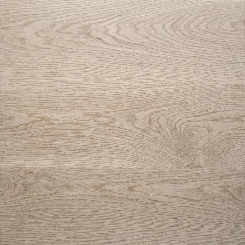
Oak, up close

Oak

m-oak-1.webp

Ash, up close

Ash

m-ash-1.webp

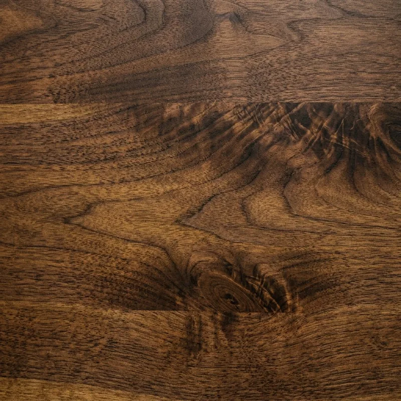
Walnut, up close

Walnut

m-walnut-1.webp

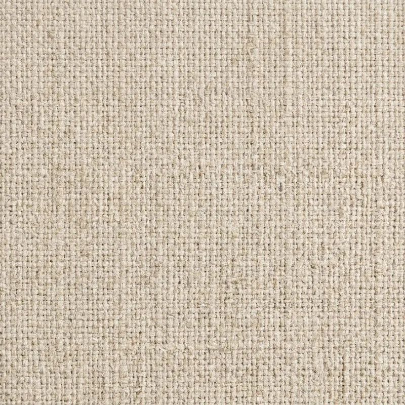
Linen, up close

Linen

m-linen-1.webp

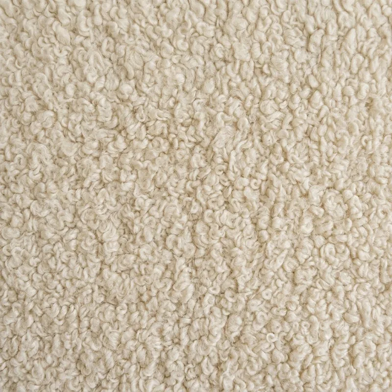
Bouclé, up close

Bouclé

m-boucle-1.webp

Brass, up close

Brass

m-brass-1.webp

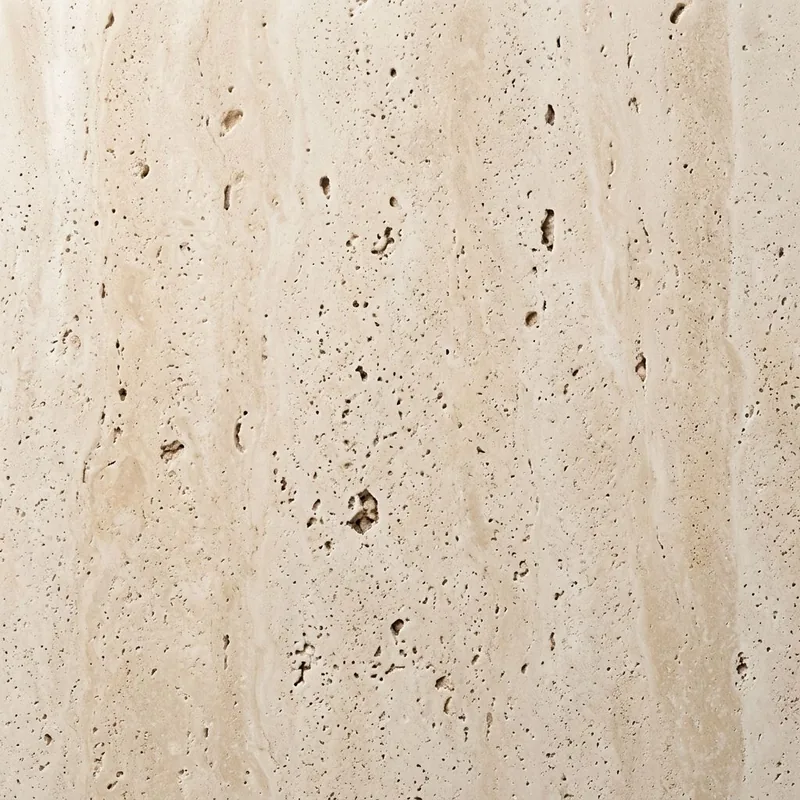
Travertine, up close

Travertine

m-travertine-1.webp

Pin

Pin

Pin

Moss daybed

Oak frame, moss linen

€2,150

View product

Marker · 36 px circle in a 44 px target
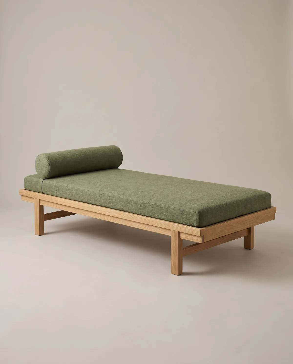
Moss daybed, oak frame, moss linen

Moss daybed

Oak frame, moss linen

€2,150

Card · opens on hover, focus or click; listed under the photo on phones
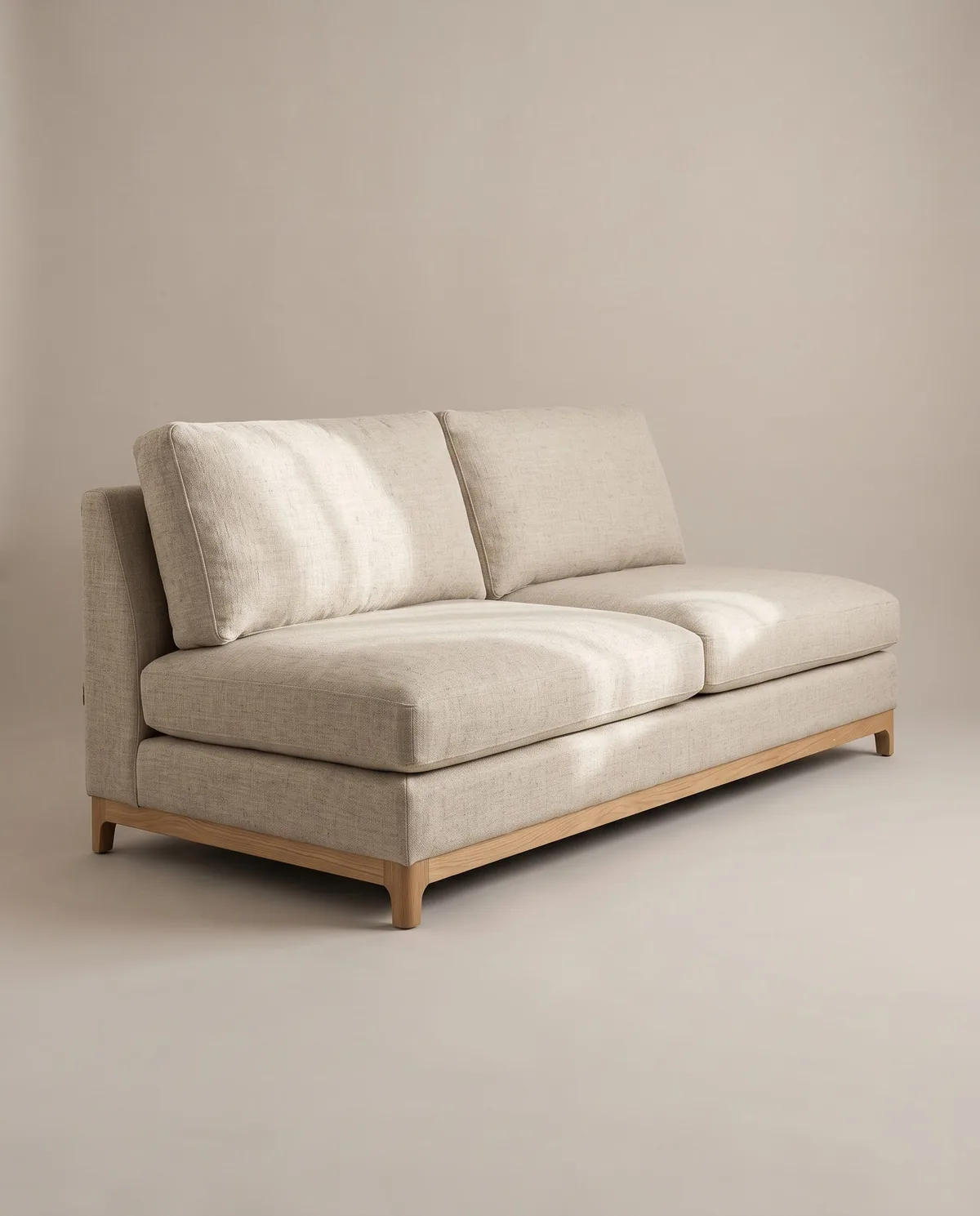
Form row

Form row

Form row

Full name

Clara H.

Email address

Enter an email address in the correct format, like name@example.com

clara.example

We reply within one working day.

Both themes

Both themes

Both themes

This page’s theme

Furniture and lighting made in Copenhagen

Send back an unused piece within 30 days of delivery for a full refund.

Made in Copenhagen. Delivered in 3 to 5 weeks. 30-day returns.
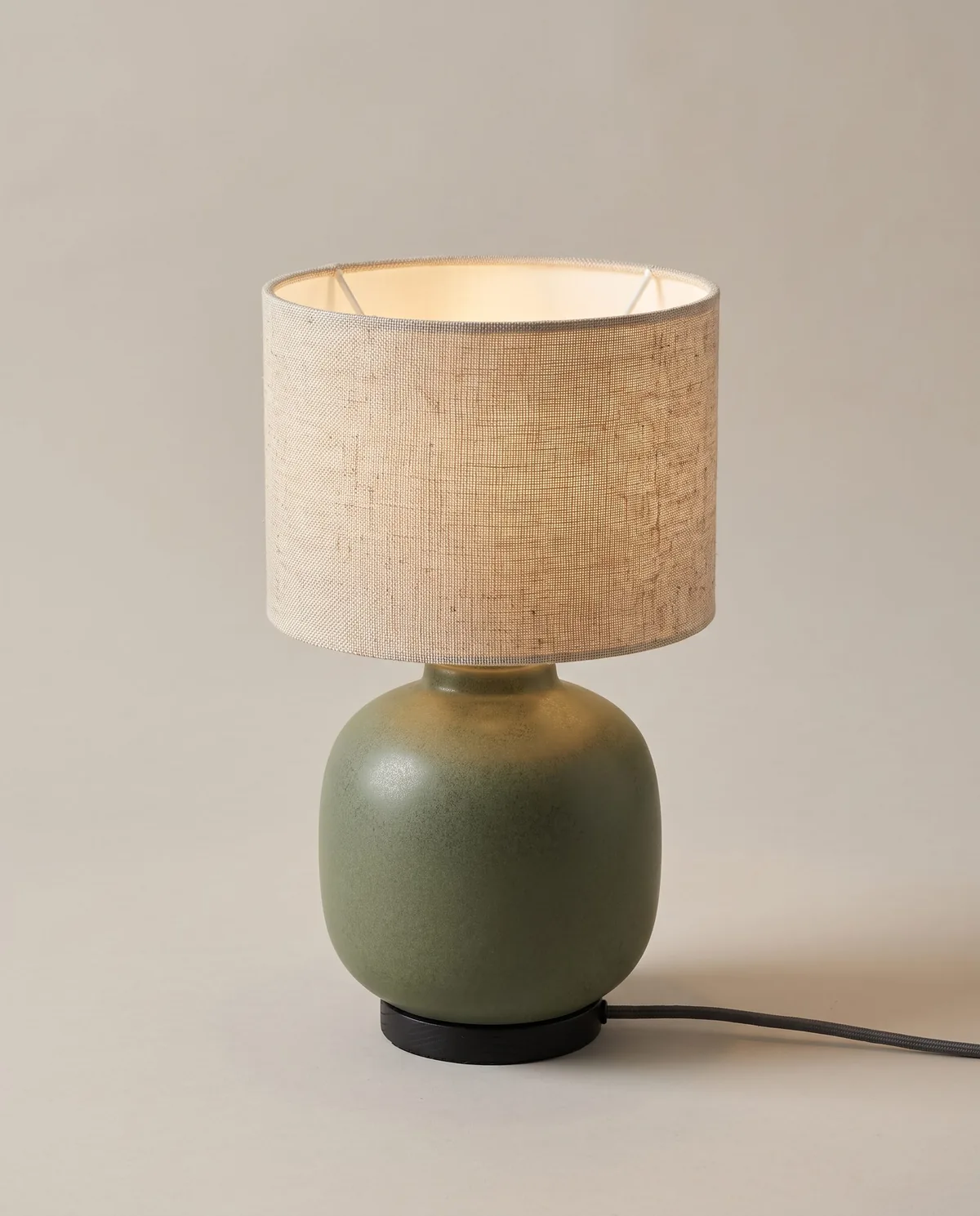
Framer shows one theme at a time. This panel follows the device theme and the theme button; press the button to see the other theme.

Furniture and lighting made in Copenhagen

Furniture and lighting made in Copenhagen

Furniture and lighting made in Copenhagen

Create a free website with Framer, the website builder loved by startups, designers and agencies.